Martin WattenbergMartin Wattenberg‘s work centers on the theme of making the invisible visible. Past projects include The Shape of Song, Third Person, the Whitney Artport’s Idea Line, and Apartment. Wattenberg is a researcher at IBM, where he creates new forms of data visualization. He is also known for the SmartMoney.com Map of the Market. He holds a Ph.D. in mathematics from U.C. Berkeley.
See also Bewitched.com

Shape of Song

2002

Shape of SongWhat does music look like? The Shape of Song is an attempt to answer this seemingly paradoxical question. The custom software in this work draws musical patterns in the form of translucent arches, allowing viewers to see–literally–the shape of any composition available on the Web. The resulting images reflect the full range of musical forms, from the deep structure of Bach to the crystalline beauty of Philip Glass.

Launch

Idealine

2001

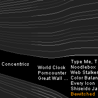
IdealineFrom the beginning, net art has travelled multiple paths. More than a medium, the net is a environment uniquely hospitable to many diverse media: programming and animation, video and audio, gameplay and community. Each individual artist picks up these threads and weaves them in novel combinations. The Idea Line is designed to let you follow these threads of thought yourself, and discover how each work is part of a larger tapestry.

The Idea Line displays a timeline of net artworks, arranged in a fan of luminous threads. Each thread corresponds to a particular kind of artwork or type of technology. The brightness of each thread varies with the number of artworks that it contains in each year, so you can watch the ebb and flow of different lines of thought over time. Launch

Apartment

2001

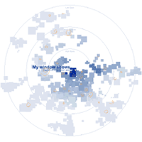
ApartmentViewers are confronted with a blinking cursor. As they type, rooms begin to take shape in the form of a two-dimensional plan, similar to a blueprint. The architecture is based on a semantic analysis of the viewer’s words, reorganizing them to reflect the underlying themes they express. The apartments are then clustered into buildings and cities according to their linguistic relationships.

Apartment is inspired by memory palaces. In a mnemonic technique from a pre-Post-It era, Cicero imagined inscribing the themes of a speech on a suite of rooms in a villa, and then reciting that speech by mentally walking from space to space. Establishing an equivalence between language and space, Apartment connects the written word with different forms of spatial configurations. Launch

Wonderwalker

2000

WonderwalkerA commission of the Walker Art Center, WonderWalker reimagines the 16th/17th-century Wunderkammer as a communal collection space.

The WonderWalker is a collection of shared objects. Like the Wunderkammer collections of the 17th century, the map is conceived as a phantasmagoria of web objects, whose reason for placement in the collection is dependent on an independent eye.

Anyone can be a collector. You become one by dragging a button to your browser’s toolbar. Then anytime you browse and something catches your eye, just add that to the collection. Launch

Adrift

1999

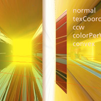
AdriftADRIFT was an evolving multi-location Internet performance event that combined movement through 3D space, multiple narratives and richly textured sound streaming between virtual and real geographies.
Recent performances were designed for presentation as spectacles in physical locations. Making use of the output of 3 vrml cameras, ADRIFT was received by three computers and projected by three projectors onto a semicircular screen. The work focused on multiple journeys through a harbor and through virtual space.

More…

Map of the Market

1998

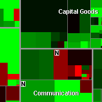
Map of the MarketA visualization that allows users to see performance of hundreds of stocks at once, with a rich context of industry and value information. A new algorithm lets an existing visualization technique, the treemap, scale more effectively. The resulting transparent view of the market has been widely adopted by financial institutions and investors.

The map lets you watch more than 500 stocks at once, with data updated every 15 minutes. Each colored rectangle in the map represents an individual company. The rectangle’s size reflects the company’s market cap and the color shows price performance. (Green means the stock price is up; red means it’s down. Dark colors are neutral).
Launch