 Information about some projects by Marek Walczak, Martin Wattenberg, Rory Solomon, Wesley Heiss, Johanna Kindvall and others will now be documented at1 http://someprojects.info….
- test [↩]
 Information about some projects by Marek Walczak, Martin Wattenberg, Rory Solomon, Wesley Heiss, Johanna Kindvall and others will now be documented at1 http://someprojects.info….
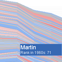 Explore the sea of names, letter by letter…watch trends rise and fall, and dive in deeper to see your favorite name’s place in the historical tides.
The Baby Name Wizard’s NameVoyager is an interactive portrait of America’s name choices. Start with a “sea” of nearly 5000 names. Type a letter, and you’ll zoom in to focus on how that initial has been used over the past century. Then type a few more letters, or a name. Each stripe is a timeline of one name, its width reflecting the name’s changing popularity. If a name intrigues you, click on its stripe for a closer look.
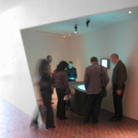 Dialog Table is a shared interface where you use hand gestures to discover more about any dynamic information. Several people can gather around and together explore the table’s movies, narratives and 3D journeys. The table provides an opportunity for people to discuss with each other their thoughts on what they have seen, whether it be an artwork. a game or a service.
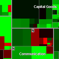 A visualization that allows users to see performance of hundreds of stocks at once, with a rich context of industry and value information. A new algorithm lets an existing visualization technique, the treemap, scale more effectively. The resulting transparent view of the market has been widely adopted by financial institutions and investors.
The map lets you watch more than 500 stocks at once, with data updated every 15 minutes. Each colored rectangle in the map represents an individual company. The rectangle’s size reflects the company’s market cap and the color shows price performance. (Green means the stock price is up; red means it’s down. Dark colors are neutral).
Launch