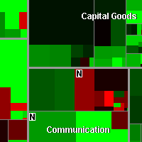
 A visualization that allows users to see performance of hundreds of stocks at once, with a rich context of industry and value information. A new algorithm lets an existing visualization technique, the treemap, scale more effectively. The resulting transparent view of the market has been widely adopted by financial institutions and investors.
The map lets you watch more than 500 stocks at once, with data updated every 15 minutes. Each colored rectangle in the map represents an individual company. The rectangle’s size reflects the company’s market cap and the color shows price performance. (Green means the stock price is up; red means it’s down. Dark colors are neutral).
Launch